Visualizing Data
by James G. Lengel, Hunter College CUNY
Sometimes technology helps us do things faster, more efficiently, such as finding specific addresses on a map, or looking up quotations. I could have done both in the library; technology shortens the time necessary, and allows me to do it from my desktop.
At other times technology enables us to do things previously impossible. An example of this is shown in Prof. Hans Rosling's five-minute video 200 Countries, 200 Years. Prof. Hans draws on a database of 120,000 numbers to help us understand human history since 1800 in a new way, made possible through new software tools. Take a moment now and watch the video.
There's lots going on here. The story that Hans tells is familiar, but the visualization of the data that provoke the story is brand-new. And the software he uses is available to all of us, and our students, for free. So is his data set.
Could he have told this story as effectively using a spreadsheet of 200 rows and 400 columns? Even with the best formulas and wizards, the tabular presentation of data is not the best way to find meaning in the numbers. But take the same data set and look at it with the visualizer, and dozens of trends begin to appear, dozens of questions arise in your mind. The act of visualization makes us think in new ways about the facts.
Professor of statistics Bill Williams at Hunter College in New York explains that old technologies have kept us in the dark about data. Because the available data-working tools -- mostly mathematical, and concentrated on calculation -- do not permit the kind of broad-scale meaning-making that you see in Hans' video, our teaching of statistics, and our methods of working with quantitative information, have tended away from the descriptive and focused on the inferential. Rather than wonder about the larger trends and big ideas, we jump directly to the t-test. We miss the forest by concentrating on the tree. Or the t, as the case may be.
Prof. Hans' forest of data is a picnic for the curious, and a five-course meal for the serious student of modern world history. To play in the forest yourself, follow these steps:
-
Connect your browser to gapminder.org.
-
Click the tab at the top, Gapminder World.
-
Wait for the data to load.
-
Slide the slider at the bottom, or click the play button, to see the progress over time.
-
Click on a circle to see the different countries.
-
Observe, think, question and wonder.
-
Watch China, the big red circle. What happened there in 1959-60?!!? Why?
-
Choose a country in the list at the right. Move the slider to trace its progress. What went on? Why?
- Click on the outliers, and consider why they might be way out there.
You can do all this online from your browser. To get it all onto your own computer so that you can play in the subway or at the beach, download Gapminder Desktop and learn some more.
Now comes the good part -- play with your own data with the same visualizing tool. Follow these steps.
-
Connect your browser to GoogleDocs. Register for an account (free) if you don't already have one; sign in.
-
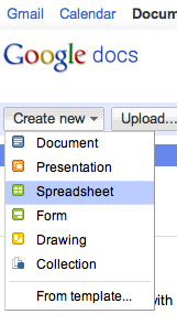
Use the button on the upper left to create a new spreadsheet.
-
-
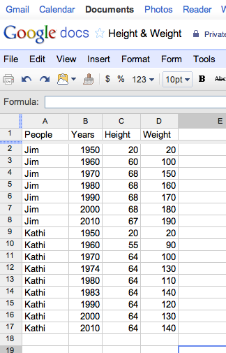
Enter or paste your data into the spreadsheet. You must do this in a certain way:
-
Entities in the first column (countries, people, states, items, etc.)
-
Time - years or months or days or hours - in the second column.
-
Data for the first variable in the third column.
-
Data for the second variable in the fourth column.
-
No blank columns or rows or cells.
-
Make sure your spreadsheet looks something like this:
-
-
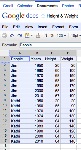
Select the data you want to visualize.
-
-
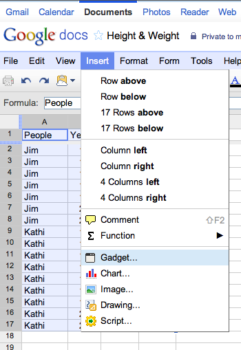
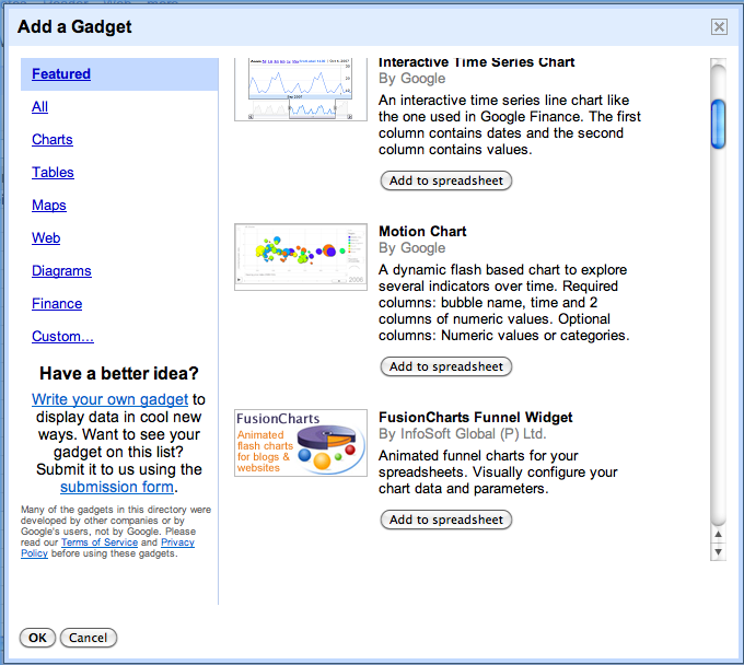
Insert a Gadget, using the Google Doc menu.
-
-
Choose the Motion Chart gadget.
-
-
Click the Apply and Close button, and watch your data visualize.
-
Slide the slider to animate the data over time.
-
Adjust the size and color of the circles as you wish.
-
Observe, think, and wonder.